Some time ago, if developers wanted to layout the page, they generally had
two options. Either use some hacky solution made of many floating elements
or use the HTML <table> element. Both approaches had their fair share of
problems. These times are fortunately gone and today we can use modern
tools designed specifically for the job.
One such tool is an ability to use grid layout in CSS. With grid layout supported in all modern browsers, there is little to no reason to use the table element for building the layout anymore. The element still has it's use - to display tabular data. It is especially important to use the right element for the purpose it was designed in a semantic web, but this is not the topic of this post.
While designing web these days is far more pleasant experience than it was let's say 15 years ago, and new better solutions are available each passing day, web is also evolving rapidly bringing new problems in.
Lately I was building a small game I had in mind. I had to use so called
hexagonal circle packing but with a gap between the circles for a more
pleasant look. I have tested multiple approaches and the one that worked
the best for the constrains of the game and the code I had written was
surprisingly grid layout.
It was a surprise for me, because the grid layout is the core of the different kind of circle packing - square packing. Square packing arranges all the circles in rows and columns and grid layout shines as a CSS solution for this.
In a hexagonal circle packing, the circles are packed more tightly together. If you tried to cut more circular cookies from one sheet of pastry, with hexagonal packing you would had less waste than with square packing. I was not trying to solve the problem of minimizing the waste, so why was I needed hexagonal circle packing?
It turns out that it is useful for displaying triangles made out of circles as well and this is the core of the game. It is possible to use other solutions but none tested were good enough.
I have learned that it is possible to use negative margins to move the elements around, even in the grid layout. You can see the outcome below:
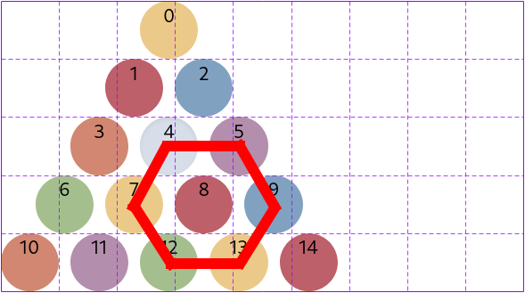
I had added red hexagon to illustrate where this packing got is name, but it should be clear nevertheless. All the circles except the circle 10 are shifted to the left with the use of negative margin.
.circle1 {
  margin-left: -60px;
}
Because of the reasons I did not understood, the same could not apply for shifting to the right - this did not do anything:
.circle1 {
  margin-right: -60px;
}
If you know why it might be the case, please let me know.
This is a 3rd post of #100daystooffload.